Hi! My name is Ruth Perry and I’m currently studying OCR A2 media studies. This blog will hopefully evidence how my knowledge and understanding of different softwares and conventions develop. I am looking forward to being able to work creatively regarding my film and poster.
Film Review

Fragmented-Finished Film
Evaluation
Film Poster

Photoshop

When starting out with Photoshop I struggled immensely when learning how to use the different tools which meant that my poster took much longer to edit than I had anticipated. Although I was determined to create a poster and film review that was visually appealing and included all of the necessary conventions therefore I watched tutorials on YouTube to teach me the skills necessary for creating the effect I wanted as well as googling basic techniques and asking my peers for advice. The main issue for me was learning how to cut out sections of images and paste them so that I would be able to create the spiral of cut up images that I initially set out to create. Once I was confident with this I was able to figure out details necessary for the rest of my poster.
Once my knowledge of Photoshop had developed, I was able to think more about the layout and general aesthetic of my poster and film review with regards to my target audience. I am pleased that I decided to persevere with Photoshop because I don’t think I would have been able to create such an effective final product on a more basic software. I was also lucky that when I came to producing my film review, one of my peers had discovered a method of moulding text around images which allowed me to present my text in an interesting and creative way. Thanks to this tip I was able to create a film review which was post modern and pleasing to the eye.
Photography for my Poster
When taking photographs for my poster I was set on creating an image which incorporated a smashed mirror therefore I smashed a small mirror using a hammer so that I could use the small broken pieces for my photography. I asked my actress to look into the mirror and pull different facial expressions as well as experimenting with lighting so that I would have more choice when I came to editing my poster. I initially struggled with this because the camera wouldn’t focus properly and the image just wasn’t looking as I had anticipated therefore I decided to take a piece of the mirror and use blue tack to stick it to the wall. I then positioned my actress so that her face would be visible in the reflection of the broken mirror. The below pictures show my actress holding the piece of mirror before I decided to stick the mirror to the wall.


Although unfortunately I couldn’t use dark lighting for this because the actresses face couldn’t be seen therefore I took some extra photographs where I turned down the light and used the light from my iPhone to illuminate the actresses face. I then experimented with aperture and shutter speed to get the desired effect. I believe the darker images are slightly better quality than the images above although I will experiment with both of them to see which will create a more effective poster.


Sketches for Poster
When trying to decide what main image I wanted for my film poster, I looked at mirror photography on Pinterest for inspiration and once I had found a collection of images which I found to be visually appealing I used them as a basis for some quick sketches to show my adaptation of the idea. I also detailed underneath the sketches what the sketch was showing so that I could make a note to myself what to photograph as well as what I would have to do to develop the images in post production.


The left hand image shows a picture which I found of a girls arm holding a circular mirror and her facial expression in the mirror. The image next to this one is a drawing I developed based on this idea although in my adaptation there are pieces of broken mirror coming out of the circular mirror and on each piece there is a different facial feature. By adding the pieces of broken mirror to the circular mirror I was able to show a flare of creativity whilst combing several different images to create a more 3 dimensional effect.


The above image is another possible idea which I had for my poster as I loved the idea of the close up shot of a hand holding the mirror although once again I have adapted the idea so that I would be able to incorporate other images. My sketch on the right hand side shows a hand holding several pieces of shattered mirror, each piece with a different facial feature, much like my previous idea. Although I decided that if I was going to break a mirror then I will carry out a risk assessment so that no one would get injured in the process.


This was one of my favourite pictures as I loved how each piece of the mirror showed a slightly different angle and this idea would give me more scope for including a variety of different photographs whilst also looking creative and post modern. My sketch is very similar to the photograph although I have drawn a circle in the middle of the mirror pieces which is potentially where I would put the title so that the audiences eye would be drawn to it as the point of focus.


This is the fourth and final poster idea and was one of my favourite. I will be most likely to mimic this idea because it’s creative and would allow me to use sections from different photographs. Although, I don’t know if I will completely copy this idea because it will be too difficult for me to cut out each section of the face and match them all up consequently I will adapt this idea by cutting out sections from photographs which don’t match up.I think will be effective for poster by making it look more dramatic and chaotic therefore reflecting my main characters mental state.
Poster Inspiration
When researching posters for my short film I decided that I wanted to convey my body image theme through manipulating photographs of broken mirrors which also links to the title of my film, Fragmented. I also decided that I wanted to cover my entire poster with images so that I would have to think more about the layout of the page and how to combine my photographs to create a pleasing aesthetic.
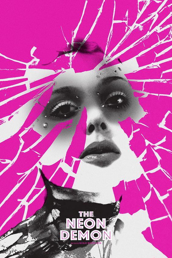
The first poster which inspired me was the one above as I loved the shattered mirror effect layered over the main image and the contrast between the black and white of the main image combined with the bright neon pink colour. I liked the layout of this poster and it gave me an idea of how I might be able to incorporate the shattered mirror photography into my film poster although it only combines two original photographs therefore I researched other film posters before using this idea so that I could think of ways to incorporate 5 original photographs.

I particularly liked the above poster and feel as though it’s particularly emotive because the character looks distressed which is shown through her facial expression and mise-en-scene. When looking at this poster I decided I wanted the lighting in my photographs to be dark and shadowy to convey the thriller genre and create a more powerful image that will be more appealing to my target audience. This poster differs from the one above as I could see how I would be able to incorporate several different photographs by piecing together pictures of my main character looking at her reflection in a shattered mirror. Although the photography was effective for making this poster look more dramatic, I decided I wanted to create further distortion of the images through the editing by cutting out sections using Photoshop. I also liked the positioning and font of the text on this poster which is another convention that I will try to mimic.

This third poster was one of my more realistic ideas for how I was going to present my own poster because although I was enthusiastic about my other poster ideas, I didn’t know how I was going to do them because although I have used Photoshop once before, I was still unsure of how to use it to its full capacity. This poster is fairly simple although particularly effective and illustrates my initial idea to cover my whole poster in images and layer text over the top. I also liked that this poster shows a lot of the characters eyes and lips rather than the full face as it makes it more ambiguous consequently I will try to create a similar effect when creating my own film poster.
Music for my Film
Music played a key part in my film when building tension and suspense regarding my female protagonist Effy played by Anna Perry as I was able to effectively combine my body image theme with the thriller genre. The music for the opening credits is somewhat sinister sounding piano music as I filmed myself ripping up images of famous celebrities to highlight their “desirable features” so that I could subtly introduce my body image theme. After this my main character has a flash back and there is an eerie droning sound effect combined with the voice over of the main character talking with echo effects on her voice to make her sound shaky and unstable. The pitch and pace of the music changes throughout the film so that I could convey the characters emotions through the sound. I wanted my music to help the audience interpret the characters thoughts and feelings so that they would be able to decipher what message is being conveyed.
After the eerie droning sound effect combined with the voice over there are several bursts of piano music in random places to convey my characters erratic mental state. I also juxtaposed happy, upbeat music with tense, sinister music. In places where I wanted it to look as though the main character is loosing her grip on reality I changed the speed of the piano music to make it faster which made in seem incongruous and out of place. Sound effects were also very helpful for my film in places where the sound seemed unprofessional looking or lacked continuity e.g. at the start of my film I used the sound effect of an alarm going off instead of the girls mum shouting “Effy wake up” as I wasn’t happy with how this sounded. These examples are just a few which explain how the music for my film was effectively paired with the visuals.
Update of Final Cut
Since using Final Cut at AS, the software has been updated and there have been changes and upgrades which was helpful for me in some ways because it was much more efficient although the software was updated when I was half way through editing my short film which meant that I was back to square one. My biggest struggle when learning how to use the updated final cut was trying to find basic functions such as text and transitions as they had moved and the icons had been changed. The way I got around this problem was by using the help search at the top of the screen which told me where to find certain functions.
Although once I solved these problems I came to find that I liked this update more that the previous instalment of Final Cut and have found editing my film to be much smoother and quicker. This meant that I was able to focus more on the production of my film with regards to the audience as I had less problems with the actual software. The transitions and effects are easy to use and have been very effective for the visuals in my film. I feel as though this was a contributing factor to the improvement of my editing skills as I had very basic knowledge of editing at AS which is no longer the case.
